The Conversation Piece #9: The Elements of LEGO Style
/
“The Conversation Piece” is a monthly BrickNerd series about creativity and building with LEGO authored by our friends over at the Builder Improvement Initiative (BII), a Discord-based community that helps LEGO builders of all levels get better at their craft through knowledge-sharing and constructive feedback.
Have a question you would like us to consider for a future article? You can submit it here. Enjoy!
Developing Style
FS Leinad asks: “How does a builder's style develop? How does style develop? Is it better to strive for a consistent style or to branch out?”
Do you have a favorite movie you throw on when you need to turn off your brain for a bit? An album or musician you listen to on loop? A video game or series of games you often find yourself returning to? Chances are, if you got a friend hooked on the same obsession, you have a shortlist of similar recommendations they may also enjoy—or maybe it has that “je ne sais quoi” and you’ve never been able to find something worthy of comparison. In either case, the key to identifying the similarities or differences of similar works lies somewhere in their style.
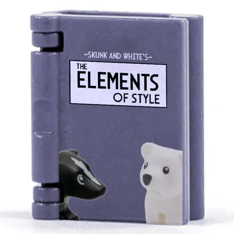
LEGO MOCs, likewise, can be differentiated by their style; some builders have mastered their style to the point that it’s what they’ve become known for! But what elements (pun acknowledged) make up what we define as style? Believe it or not, we’ve actually been talking about these elements throughout our articles; we just haven’t been connecting the dots! Fortunately, famed professor “William Skunk Jr.” and writer “P. B. White” are here to help with an abridged version of their book “The Elements of Style.”

Broad Definition of Style
But what is style, really? Before we break style down into its individual parts, it would be beneficial to look at it holistically. Merriam-Webster defines style simply as “a particular manner or technique by which something is done, created, or performed.” What “manner” or “technique” is defined as depends largely on the medium the work is made of. In cinema, these include lighting, SFX, VFX, story structure, scripting, camera work, etc. In gaming, this could include art direction, mechanics, storytelling, and music. Graphic designs can be stylized through shapes, fonts, colors, and level of detail.
So, how do we define style in a LEGO sense? We’ve identified the following markers of a build’s style:
Genre
Shape Language
As mentioned, we’ve written about most of these topics in some capacity: just not from the lens of style. In the rest of this article, we will take another look at these topics with a focus on how they impact style. If you’re interested in a further dive into these topics, the appropriate articles are linked above. It should also be noted that this list is non-exhaustive; style can also be influenced by presentation, scale, or even minifigure preferences, to name a few. But like any good piece of media, we always leave the door open to a sequel… So what makes up a builder’s style?
Genre
When we look at any form of media or art, we find that pieces tend to fall into categories based on various conventions and ideas. These categories, called genres, serve as a space that spurs the development of build styles and communities for builders in their favourite theme. We see that style develops in these communities through trends, inspiration, subject material, and participants in the group. These factors create a cultural framework that is unique to every genre and leads to trends in build styles. While genres can have different “sub-styles” determined by factors such as scale, part usage, or aesthetics, genres exhibit levels of continuity among their members.
The genre of vehicles provides us with a wonderful example of continuity within the genre. Ron Dayes provides a classic spin on vehicle design using simple and classic parts at a 1:45 scale, while Isaac W. opts for a cartoonier 4-wide design. Despite some aesthetic differences, the overarching style of detail, accuracy, and attention to scale unites these two builders.


Ron Daye’s “Mercedes Benz NG Autotransporter” (left) and Isaac W.’s “Dodge B100 Van & camper” both use classic parts to create cars with very different styles.
Even within an established piece of media like Star Wars, we can find a unique building style that many builders utilize. This genre is hallmarked by a lack of visible studs, clean and sleek structures, modern LEGO parts, black borders, and tile & slope terrain. “OCCUPATION OF BATUU” by Malen Garek et al. perfectly showcases this using a variety of pieces to achieve a smooth and consistent design for the primary structure. In Liam Hunter’s untitled build, we see the same key points of the genre: clean angles, a minor amount of studs, black borders, and the use of modern elements. While these builders have differing elements to their styles, the key themes of the genre itself remain visible.


“OCCUPATION OF BATUU” (left) and “untitled” (right) are very different builds, but share similarities in what most Star Wars builders prioritize in their builds.
This isn’t to say that genre limits style, either: sometimes, a style is notable for its subversion of trends in the genre. “DARK TIMES | 19 BBY” by iChocoTiramisu, while a Star Wars build, utilizes older and worn/yellowed LEGO parts to create a style of build reminiscent of classic sets. Similarly, Classic Brix’s “TSMEU-6 Wheel Bike” marries classic parts and colors with modern ones to recreate the iconic vehicle from Revenge of the Sith. While the vehicle is faithful to the source material, the use of old greys and classic hinge tiles invokes a sense of nostalgia.


“DARK TIMES | 19 BBY” and “TSMEU-6 Wheel Bike” both use classic parts to create a style that instills a sense of nostalgia for classic LEGO sets.
Color
Color itself is a defining tool in shaping personal style and establishing a visual identity. Much like how genres provide a cultural framework that unites builders through a series of conventions, the use of color can similarly create distinction in a MOC builder’s work. One of the most direct applications of color as a stylistic device is color blocking. Here, bold and often contrasting tones are arranged in discrete sections to create a striking, graphic effect. This approach emphasizes clarity and vibrancy, giving the build a strong visual presence. A notable example of this technique can be seen in Alex’s “HORiZON DOLL,” whose use of sharply divided colors generates a sense of energy and boldness.

Alex uses bold color blocking to convey energy and excitement.
By contrast, some builders prefer to pursue a seamless flow of color through gradients. This method allows for a more subtle and natural visual rhythm, often enhancing the impression of depth and realism. Hubba Blooba’s “Bridge Haven” uses this to great effect, creating an atmosphere that one may expect to see in a watercolor painting.

Hubba Blooba has explored this approach, using the wide range of LEGO colors to create carefully graduated transitions.
Another method of using color is demonstrated by Simon Hundsbichler, who layers families of tones to deepen the visual richness of his builds. He blends earthy colors (e.g., dark brown) with complementary hues (e.g., dark blue and dark green) to create a greater sense of depth than possible with pure color blocking or gradients. Simon’s technique is similar to the painterly approach of the Impressionists, particularly William McTaggart, who also used subtle modulations of color to suggest atmosphere and create depth within landscapes.


“Wolf” by Simon Hundsbichler layers colors to create a style reminiscent of Impressionist paintings, such as Sir William MacTaggart’s “The Wigtown Coast” (image via National Galleries).
Equally powerful is a builder’s deliberate restraint of color. Avant-garde builder, Why.Not?, utilizes primary colors in a field of monochrome bricks as a vehicle to evoke moods in their builds. The highlight of color helps guide the viewer’s attention and adds an extra narrative to the build.

“untitled” by why.not? uses colors sparingly to create a striking and uneasy scene.
Texture
Studs. Greebles. Weathering. These are all terms that MOC builders have come to associate with our third cornerstone of a builder’s style—texture. While individual builders may be recognized for their inclination towards a specific theme or their use of a consistent color palette, it’s the execution of MOCs that offers builders the most opportunity to develop a signature aesthetic.
Translating the rough stone texture synonymous with castle and fantasy themes into brick form, for instance, has yielded countless different interpretations over the years. Ralf Langer’s approach to stonework combines heavily textured sections using various rounded tiles and masonry bricks, contrasted with smooth areas of wall.

Ralf’s aptly named “Medieval texture madness” uses both rough and plain surfaces to create an instantly recognizable style.
…whereas Legonardo Davidy has made simple use of tiles and plates laid over a flat wall to create an altogether completely different look which can be found across a number of his medieval creations.

Legonardo employs plates and tiles offset from the walls to create a heavily weathered look.
Some styles of builds are notable for the absence of texture, as well. Jonah Schultz’s builds tend to feature subtle texturing, if any at all. Despite the plate/tile wall and the occasional flower stud, his build “Slice of Life” is remarkably clean, and in conjunction with his savvy presentation skills, creates a stylistically polished look. Similarly, his build “The Polymath: Relaxation,” while an older work, employs the same plate/tile layering technique for the wall and utilizes basic tiles for the floor design.


Jonah Schultz opts for subtle texturing in his builds to create a clean, polished appearance.
Shape Language

Behind every art theory lies a hidden language that we inherently understand. Just like how colors and color schemes can be leveraged to invoke a style, shape language can be used as well. Character design uses this concept to great effect. In the book “Sketching from the Imagination: Character Concepts,” Hugo Beaurepere discusses how shape language affects his drawings: “Shapes are always a big part of my design work, playing an essential part in my process and enjoyment of the craft. Like color, shape language can have a huge influence on how we view things and can help artists to create unique and appealing characters” (pg. 34).
Looking at his work, it becomes obvious that this is an important factor in his designs. His piece “Grandmas Gang” is mainly comprised of rectangular and square shapes, and while each character uses them in different ways to give them each their own personality, they still feel stylistically consistent. While “Bikers” exhibits a very different group of characters, they also consist mostly of round and square shapes and feel like they could reasonably belong in the same world as the suave trio of grandmas.


LEGO builders can leverage this, too, and not just character builders! Maxx Davidson is a master of clean and adorable builds, and similarly to Hugo, uses circles and rectangles to achieve this. “The Sick Viper,” “Reverse Mermaid,” and “In the Kitchen” are all very different types of builds. However, each of them utilizes curved and sloped pieces to create a very smooth and cartoony style of build with minimal sharp edges: a perfect fit for the wacky and whimsical build style he’s known for!


Just as in the case of texturing, the absence of shape can also be a major style choice. However, rather than making a build feel cleaner, this tends to make builds more organic. Take, for example, the two examples of rockwork below. “The Postal Pathway” by Roanoke Handybuck utilizes large curved/round panels and windscreens to create a shapely set of cartoony rocks. In contrast, Eero’s “Scale the Depths” makes use of slopes to create a natural facade without much shape definition. Whereas one has well-defined shapes that convey a sense of whimsy, the other one values realism instead, selling the fact that the climber is in quite a perilous place.


“The Postal Pathway” (left) prioritizes the use of shapes to create a cartoony look, while “Scale the Depths” (right) values clear shapes less in favor of natural texturing.
Techniques and Parts Usage
Can you recognize the movie or video game a song belongs to from a few simple notes? Can you identify an artist by the way they draw faces? Chances are, you can think of a few iconic examples. These motifs are cornerstone pieces to the body of work, and in LEGO building, we have our own version of this.
After building a specific genre enough, you may find yourself beginning to reuse assemblies from past builds; this is an expression of style! A substantial number of prolific builders can be instantly identified by a small portion of a build. Oftentimes, these assemblies highlight core attributes of the style. Humanoid character builds are the most common case of this behavior, as the base features tend to be similar from build to build. Builders who aim for cartoony/cutesy characters may have a favorite low-detail, large-eyed head design, while builders who prefer more lifelike characters may go for a face design with more realistic shaping. As a little test, try guessing the builder from the images below before clicking on it to see if you’re right.


You may also find yourself favoring specific parts or eras of parts. These are often subconsciously influenced by style (or vice versa). A core feature of Slice-of-Life-style builds is their sparing use of complexly molded parts (most of which are from recent years). Instead, the style favors standard bricks, plates, and tiles and utilizes old-school specialty molds, such as windows and fences. “South of France” by Jackson and “I’ll Smoke Here If I Want To” by iterative_bricks both showcase the Slice of Life style, constructed mostly of bricks and using classic window and fence molds for detail.


“South of France” (left) and “I’ll Smoke Here If I Want To” (right) are perfect examples of the Slice of Life style.
In contrast, builders who are aiming for a more organic style may gravitate to parts with more detailed and complex molds; feathers, plants, and minifigure accessories are commonplace in these types of builds. Jayfa’s “Draconis Lepidoptera” uses spiky large figure armor, modified rock plates, and eggshells/crowns to create a highly-textured and frighteningly adorable Luna Moth Dragon.

A Holistic Revisit of Style
As previously mentioned, there are other elements of style; however, the ones discussed are arguably the most significant and identifiable in MOCs. Using each one of these elements to your advantage can better equip you to design MOCs that you feel proud of.
Building can be a struggle sometimes, and when a build doesn’t look wrong per se, but also doesn’t feel right, a disconnect between where you envision a build’s style to be and where it actually is may be the answer. If you are a fan of simple illustrations, you may try building with low textures, strong color blocking, and emphasized shapes. Likewise, if you are a fan of paintings or immersive worlds, you may elect to do the opposite and design highly textured builds utilizing gradients and minimal obvious shapes.

That’s all from “Skunk & White” for now. But we’re not quite done talking about style yet; in an upcoming article, we will be discussing how styles develop through the personal accounts of some of our contributors. If you have any follow-up questions you’d like us to discuss, comment them below or join our server to ask us directly!
Written by Jackson, Kit Nugent, Oshi, and Eann McCurdy.
Have a question for a future article in The Conversation Piece? Let us know in the comments below!
Do you want to help BrickNerd continue publishing articles like this one? Become a top patron like Marc & Liz Puleo, Paige Mueller, Rob Klingberg from Brickstuff, John & Joshua Hanlon from Beyond the Brick, Megan Lum, Andy Price, Lukas Kurth from StoneWars, Wayne Tyler, Dan Church, and Roxanne Baxter to show your support, get early access, exclusive swag and more.